A Beginner’s Guide to Color Theory in Photography: Harnessing Hue to Craft Stunning Visual Narratives
Color is a potent tool in a photographer’s arsenal, capable of transforming a mundane shot into a visual masterpiece. Understanding color in photography composition involves more than just distinguishing between primary and secondary colors. It’s about the narrative, the emotion, and the atmosphere that color creates. This article unravels the intricacies of color, helping you harness its full potential to elevate your photographic artistry. Reading through, you’ll unlock a new dimension of photographic creativity that sets you apart in the saturated world of photography.
What is Color Composition in Photography?
Color composition is the art of using color to enhance the aesthetic appeal and effectiveness of a photograph. It involves understanding color relationships and how different colors impact the mood, focus, and storytelling of the photograph. Delving into color composition will open up a new realm of possibilities, empowering you to use color as a robust narrative tool in your photography.
Why is the Color Wheel Significant in Photography?
The color wheel is a fundamental guide to understanding color relationships. It helps photographers identify complementary, analogous, and triadic color schemes, which are crucial in creating visually pleasing images. By mastering the color wheel, photographers can create color harmony, contrast, and a visually pleasing color palette in their compositions.
How Does Color Contrast Enhance Photography Composition?
Color contrast is about juxtaposing opposing colors to create a focal point, highlight a subject, or add visual interest. Understanding color contrast is crucial for photographers aiming to direct the viewer’s attention and create strong photo compositions. By manipulating color contrast, you can accentuate key elements within a frame, guiding the viewer through your photographic narrative.
What Role Does Color Theory Play in Photography?
Color theory is the backbone of color in photography composition. It encompasses the principles and guidelines for using color effectively to create a harmonious and aesthetically pleasing image. From understanding primary, secondary, and tertiary colors to exploring the emotional and psychological impact of colors, color theory is an indispensable knowledge area for every photographer.
How Can Complementary Colors be Used Effectively?
Complementary colors, situated opposite on the color wheel, offer high contrast when used together, making them pop. Effective use of complementary colors can create a dynamic and visually stimulating composition. It’s a technique often used to draw the viewer’s attention to a particular element or create a vibrant, energetic mood within the image.
What are Some Effective Color Schemes in Photography?
Various color schemes, such as monochromatic, analogous, and triadic, provide a structured framework for utilizing color in photography composition. Each scheme offers a unique aesthetic and mood, enabling photographers to evoke specific emotions and tell different stories through their images.
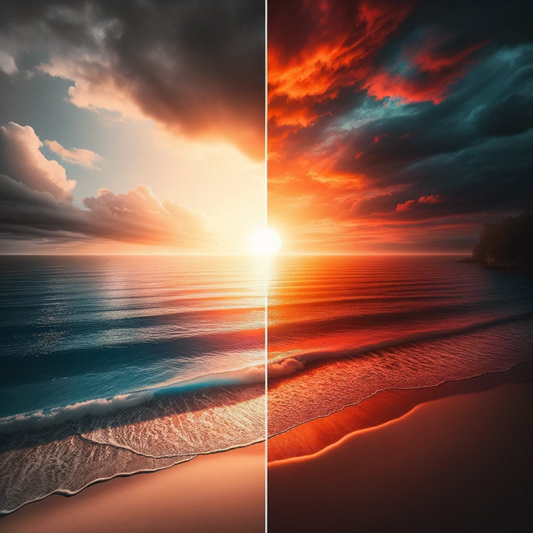
How Does Saturation Impact Color in Photography?
Saturation refers to the intensity of color in an image. High saturation colors are vivid and eye-catching, while low saturation colors are muted and subdued. Understanding saturation and how to adjust it can significantly impact the mood of an image, offering a powerful tool for photographers to control the visual appeal and emotional resonance of their compositions.
What is the Role of White Balance in Understanding Color in Photography?
White balance is a camera setting that adjusts the color temperature of a photograph, affecting how colors are rendered. By mastering white balance settings on your camera, you can ensure accurate color rendition and create a specific atmosphere within your shots, ranging from warm to cool tones.
How Can Colors Work Together to Create Mood in an Image?
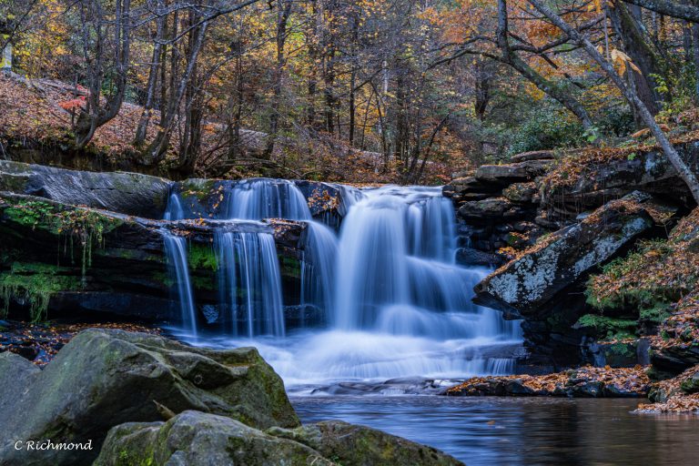
Colors can be used strategically to create mood in an image. Warm colors like red and yellow evoke feelings of warmth, comfort, and energy, while cool colors like blue and green evoke tranquility and calm. Understanding how to use color to create mood is a fundamental aspect of photography composition that can significantly enhance the emotional impact of your images.
How to Continue Growing Your Understanding of Color in Photography?
Like any other skill, mastering color in photography composition requires continuous learning and experimentation. Engage in photography exercises focusing on color, read books, attend workshops, and learn from other photographers. Continual learning will refine your understanding of color, enabling you to use it more effectively in your photography.
Bullet Point Summary:
- Delve into color composition to use color as a robust narrative tool in your photography.
- Master the color wheel to identify complementary, analogous, and triadic color schemes.
- Utilize color contrast to direct the viewer’s attention and create strong photo compositions.
- Explore color theory to understand the principles of using color effectively in photography.
- Use complementary colors to create dynamic and visually stimulating compositions.
- Experiment with different color schemes to evoke specific emotions and tell different stories through your images.
- Understand and adjust saturation to control the visual appeal and emotional resonance of your compositions.
- Master white balance settings to ensure accurate color rendition and create a specific atmosphere within your shots.
- Use color strategically to create mood and enhance the emotional impact of your images.
- Engage in continuous learning and experimentation to refine